
SecureShip Landing Page Concept
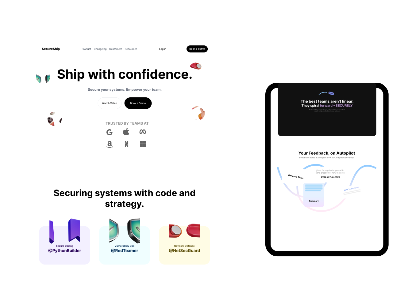
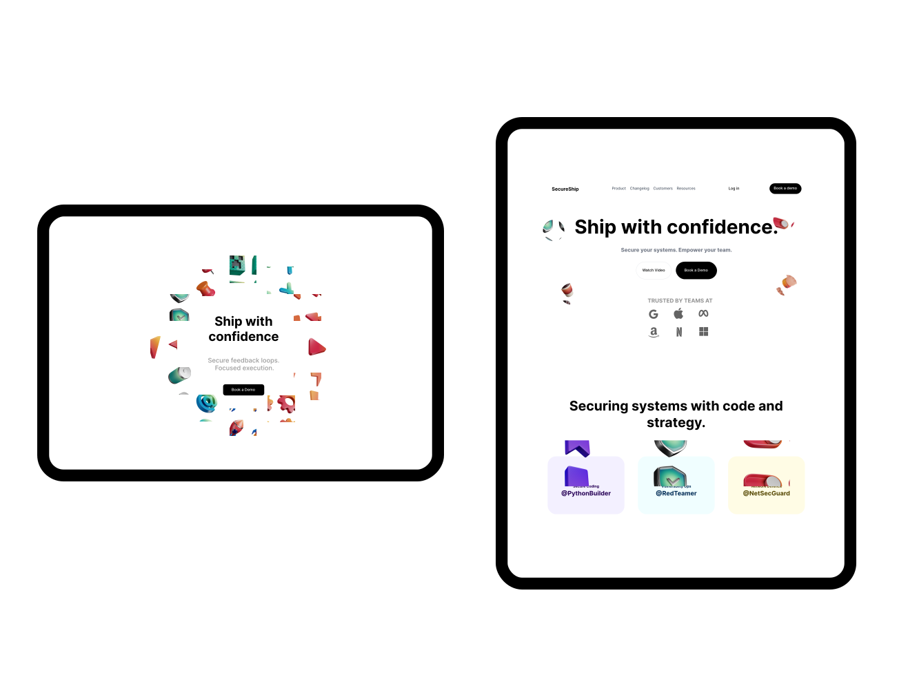
A narrative-driven SaaS landing page that demonstrates how teams transform scattered feedback into secure, focused product work. The design blends minimalist typography with engaging 3D assets to create a dynamic scrolling experience that feels both enterprise-grade and approachable.
What I learned:
- Integrating 3D Assets: I learned how to balance playful, floating 3D icons within a clean, flat interface, ensuring they enhance the visual hierarchy rather than cluttering the breathing space.
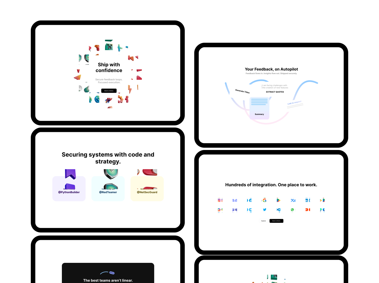
- High-Contrast Pacing: Implementing the stark dark-mode block ("The best teams aren't linear") taught me how to use severe color contrast to break up page sections, control the user's scrolling rhythm, and draw attention to key statements.
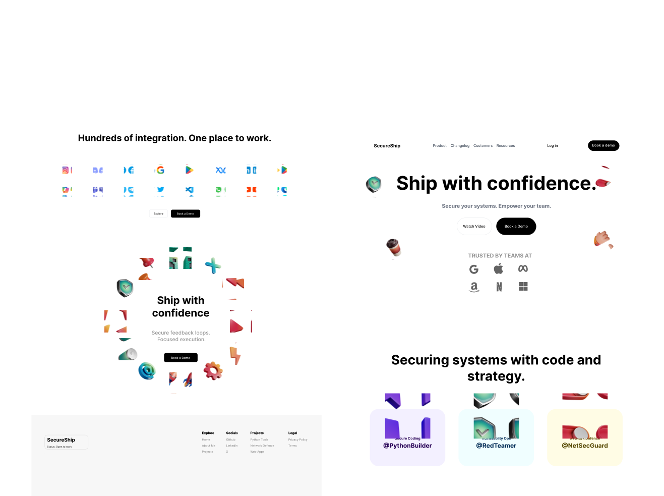
- Complex Component Structuring: Designing the overlapping UI cards in the "Autopilot" section and the radial layout in the footer reinforced how to visually plan complex, responsive layouts that easily translate into modular React/Next.js components.
- Managing Density: Organizing the "Hundreds of integrations" grid refined my approach to spacing and aligning large sets of elements within strict container constraints while keeping the interface feeling lightweight.
Work Process
Research
Defining business goalsUser research
Research
BrainstormingIdea generationMoodboard
Design
User flowWireframeUI conceptResponsive design
SITEMAP
Home
Product
Features
Price
Changelog
Release notes
Customers
Testimonials
Resources
Blog
Guides
Log in
Authentication dashboard
Book a demo
Contact sales
Calendar
Color & Typography
AaInter
Green#46B18E
Yellow#FFF9C4
Violet#7D43D9
Colors
Very Dark Gray#151515